Houndify Rebrand
Role: Creative Director, Art Director, Designer
Mediums: Logo, Identity, Typography, Illustration, Content, Videos, Iconography, Colors, Grid System, Brand Guidelines
About:
Overall brand refresh for Houndify. Working cross-functionally between design, content, product, and development teams, this project came together and successfully launched.
Logo
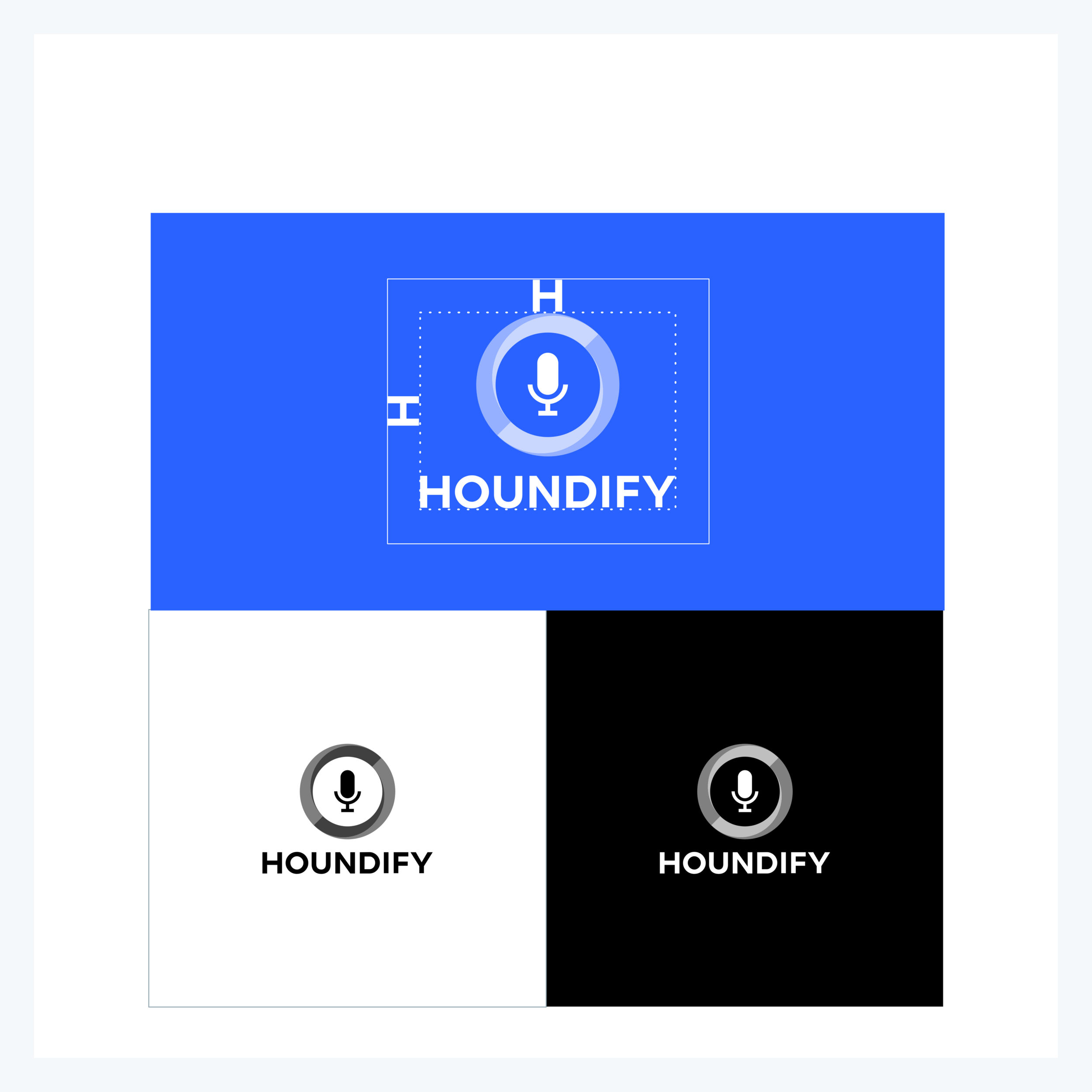
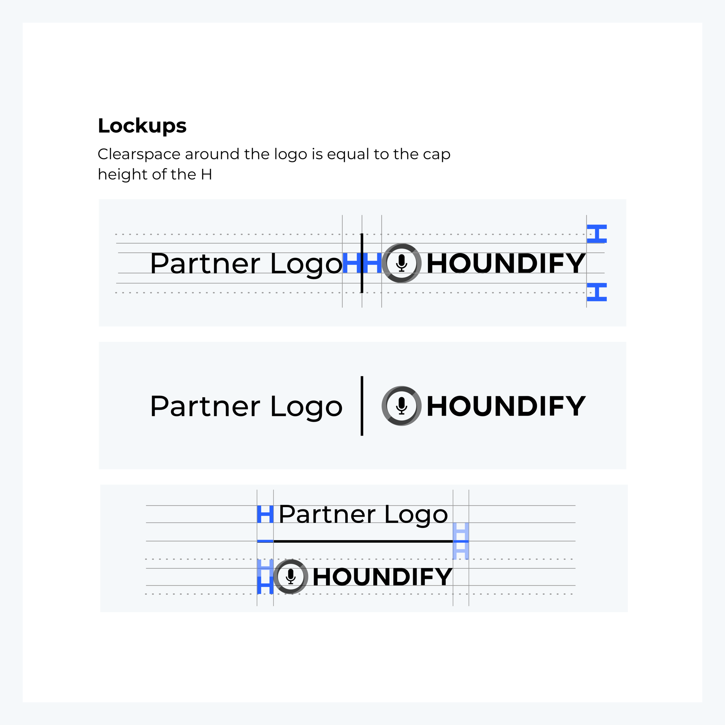
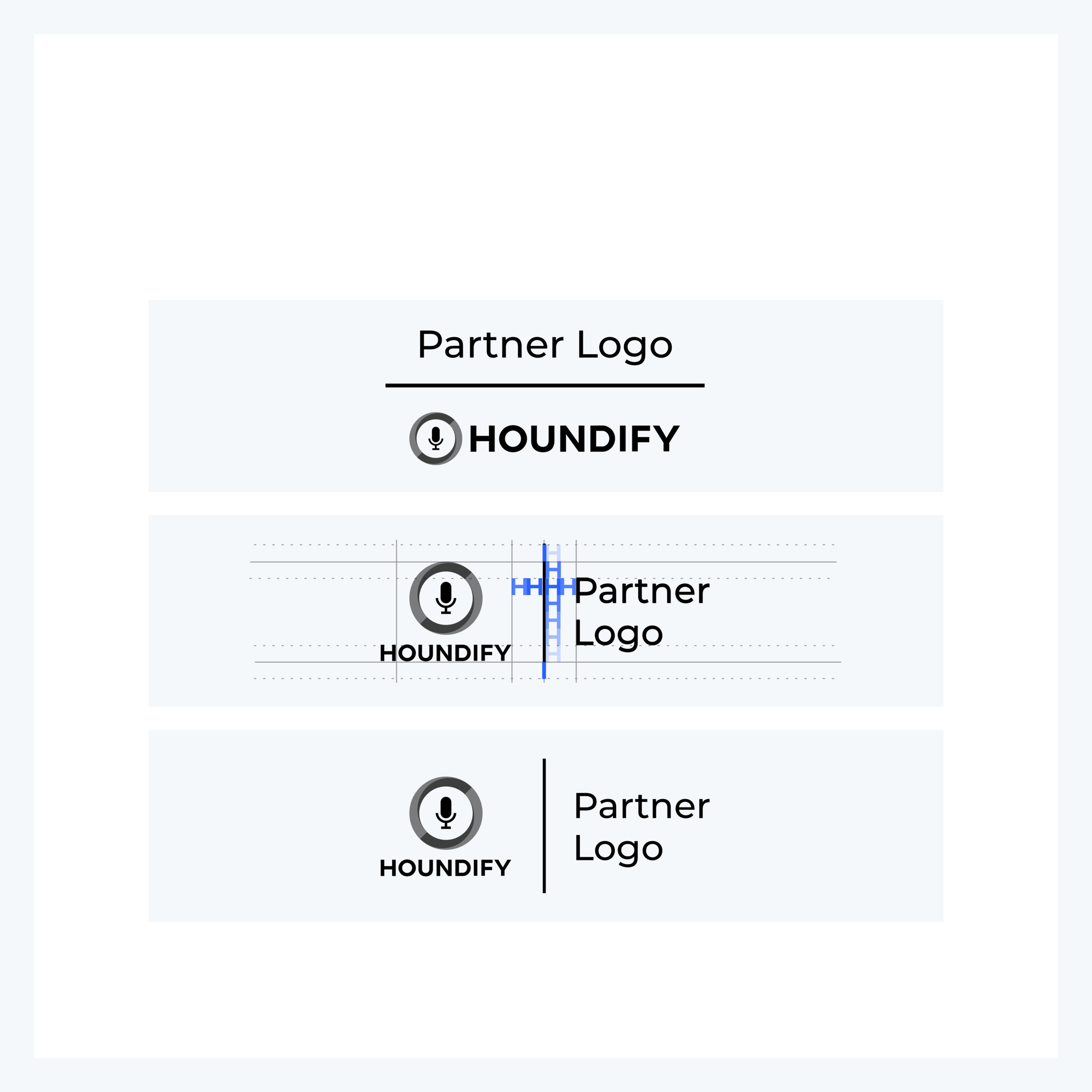
The Houndify logo is a legacy asset. To further improve on the wordmark, we created guides for color sets, spacing details, and partnership lockups.

Illustration
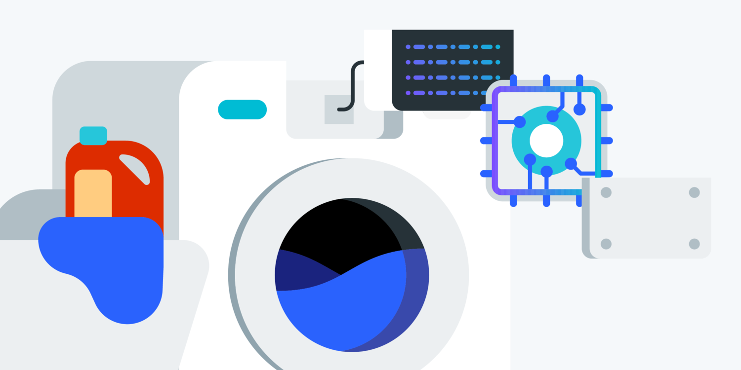
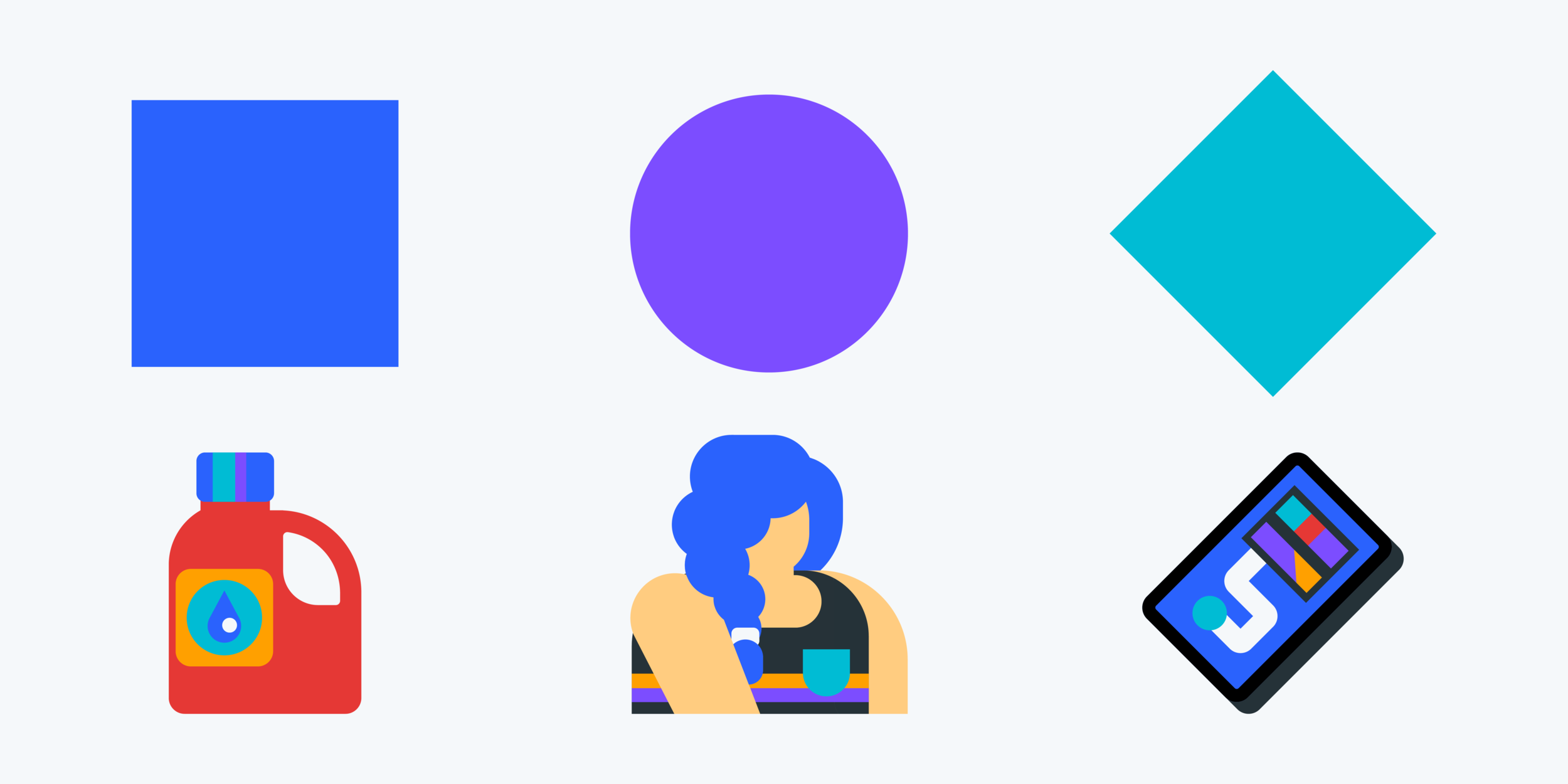
When creating these illustrations, I decided I would always build off of basic shapes. This helps keep the element straightforward in development as well as outcome. Minimal style helps the brand identity become a recognizable yet dynamic visual.














Grid System
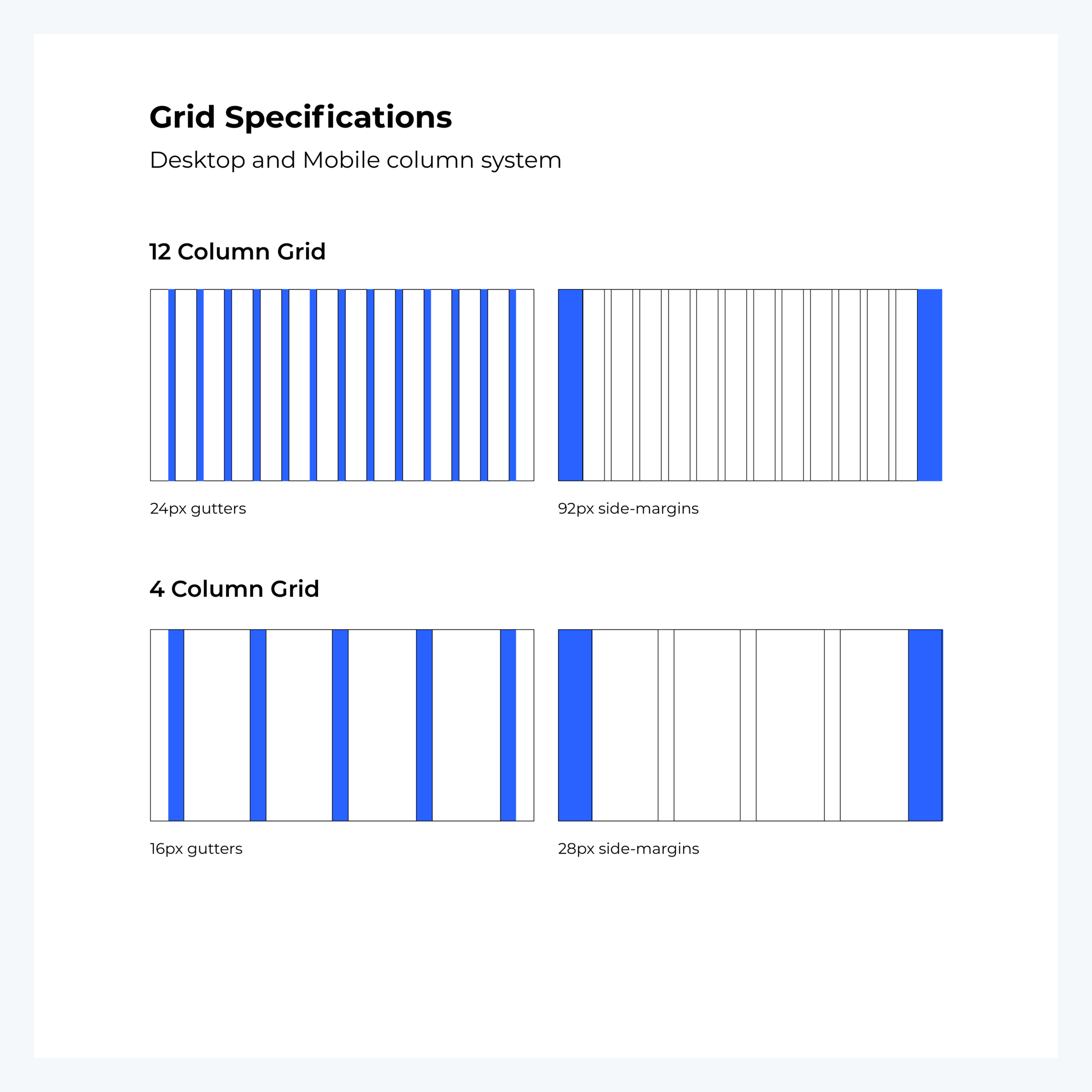
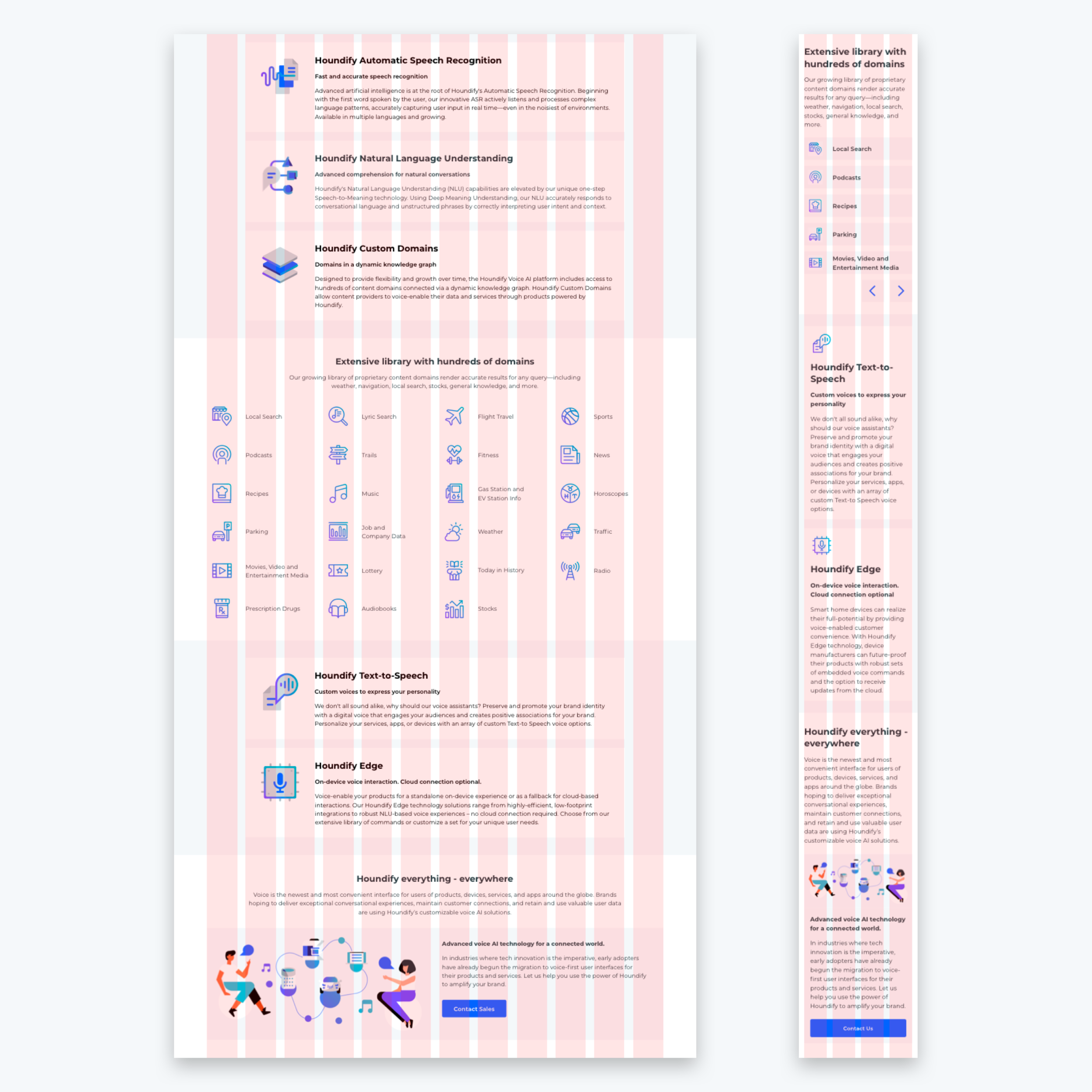
For desktop we settled on a 12 column layout grid and a 4 column for mobile. Referencing Google’s Material Design guidelines for responsive grid systems, we adapted ours to have increased side margins to avoid text crowding on left and right sides.
Font Family
The font family Montserrat was chosen as the primary font for Houndify. It is a clean font that is not only legibly accessible, but also versatile with a variety of weights.


Color System
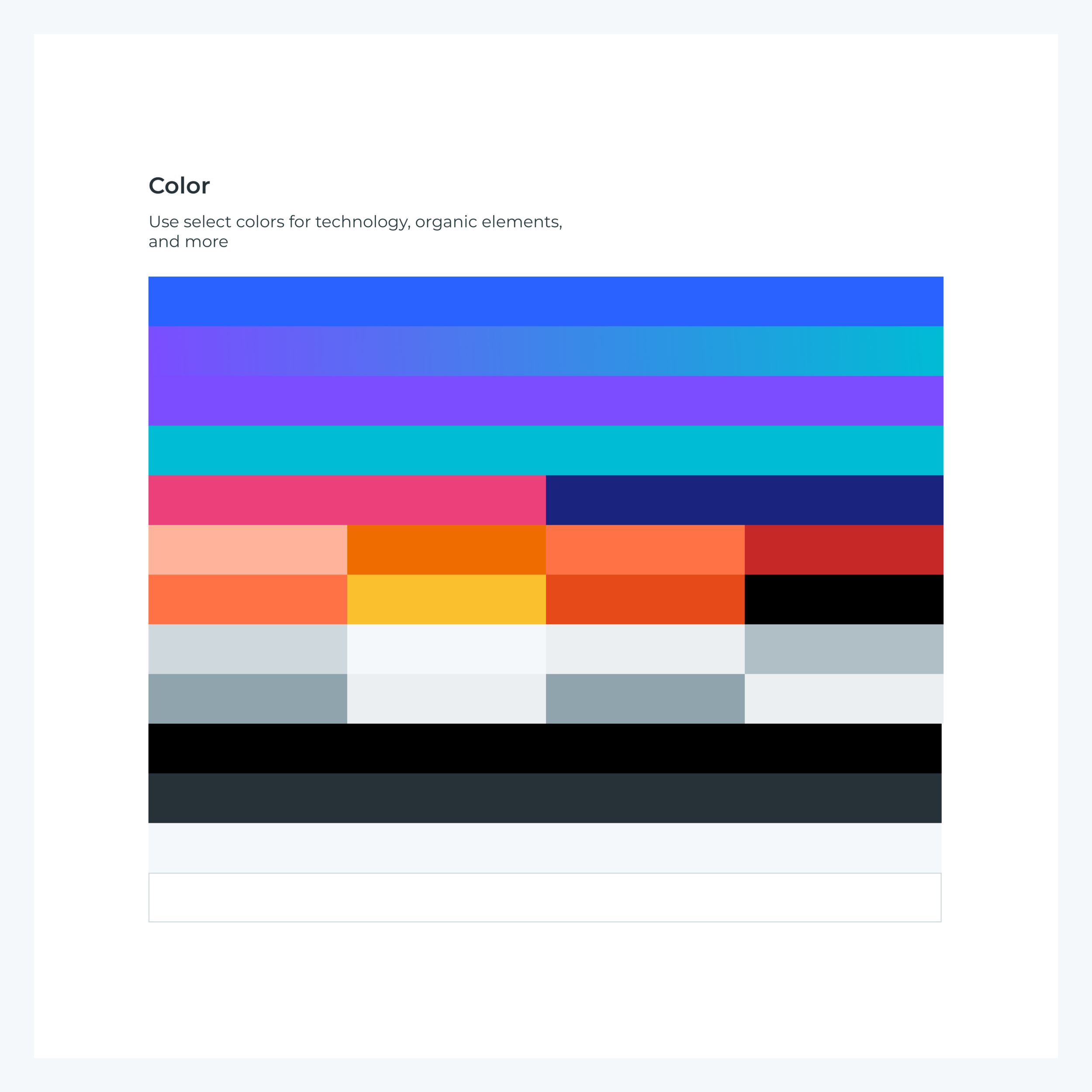
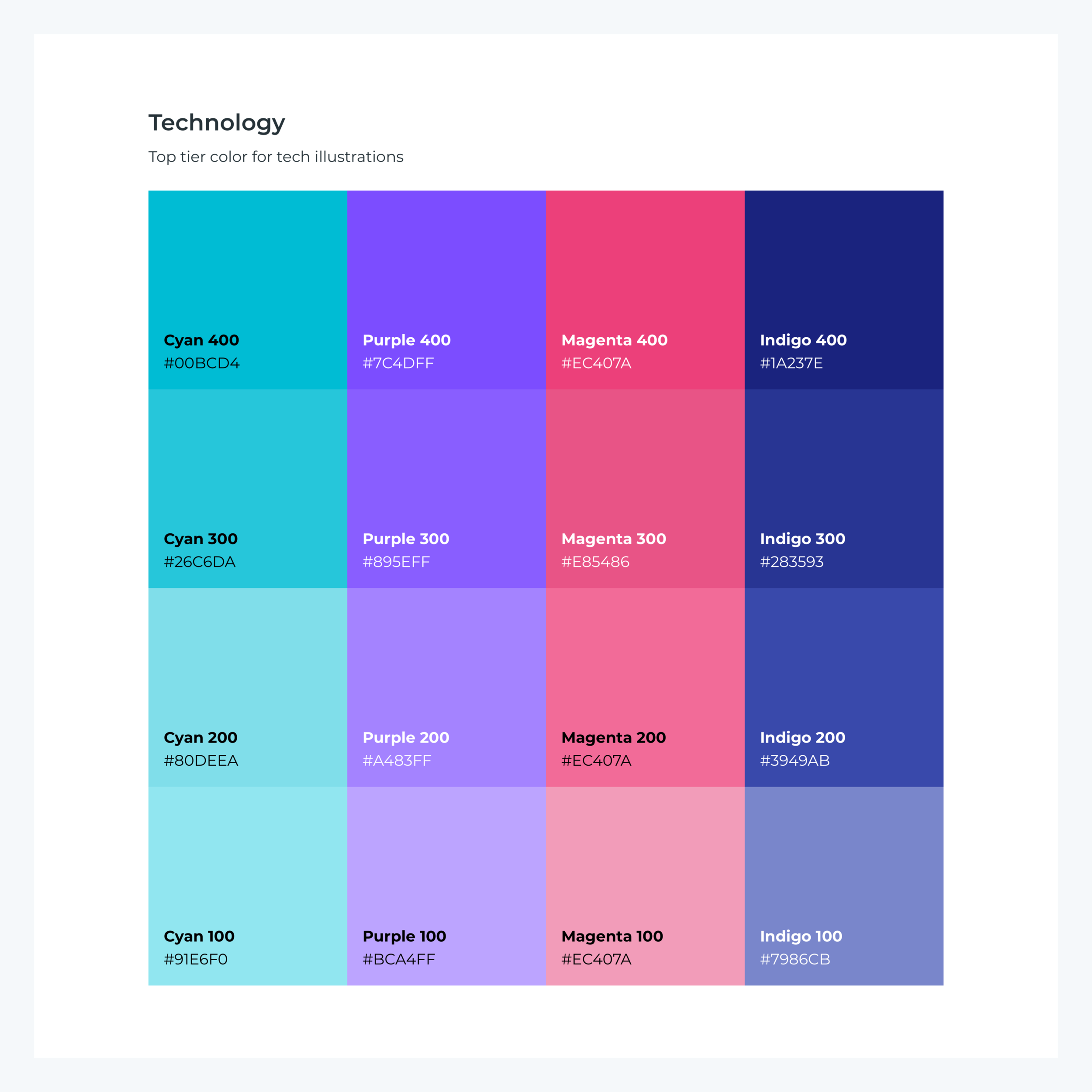
The Houndify brand colors are developed to focus on the Hero Blue, which represents the AI platform. Enablement and function are represented with Cyan and Purple. Going down the palette, the cool colors are used in areas of technology or business, and the warm colors to be used in organic elements such as people and food. All colors are utilized in creating icons, illustrations, and web layouts.

Iconography
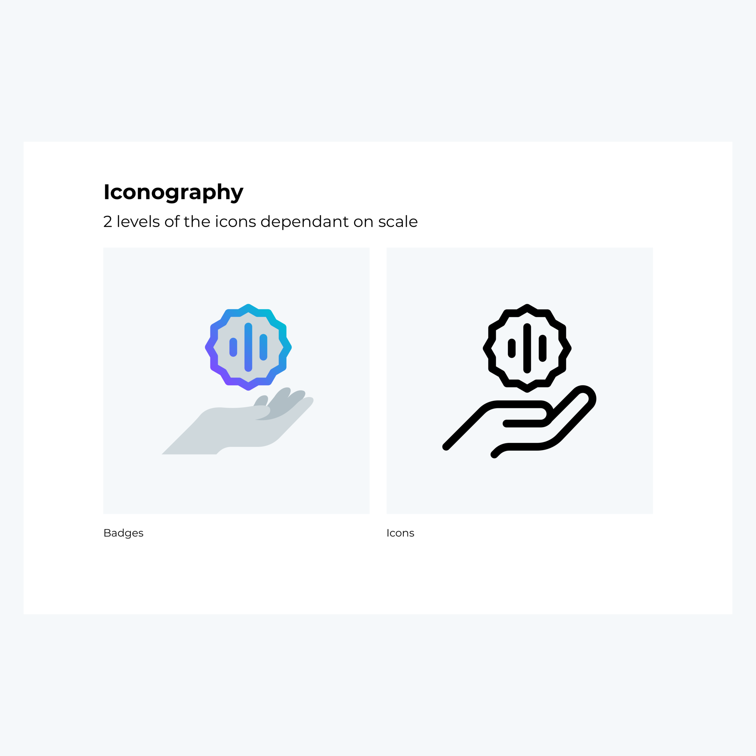
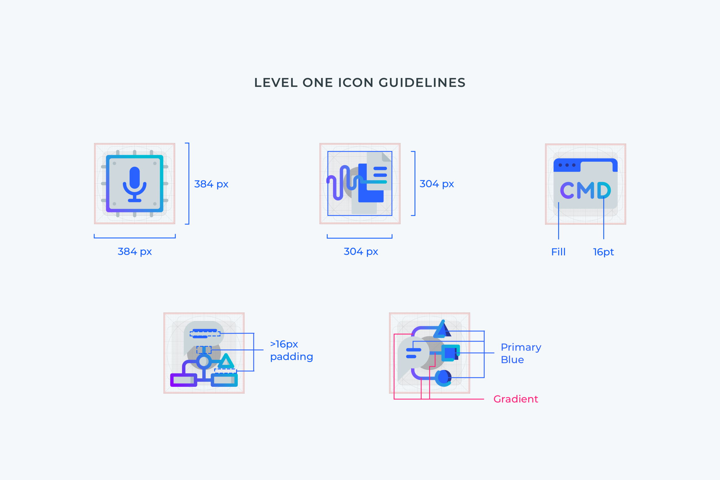
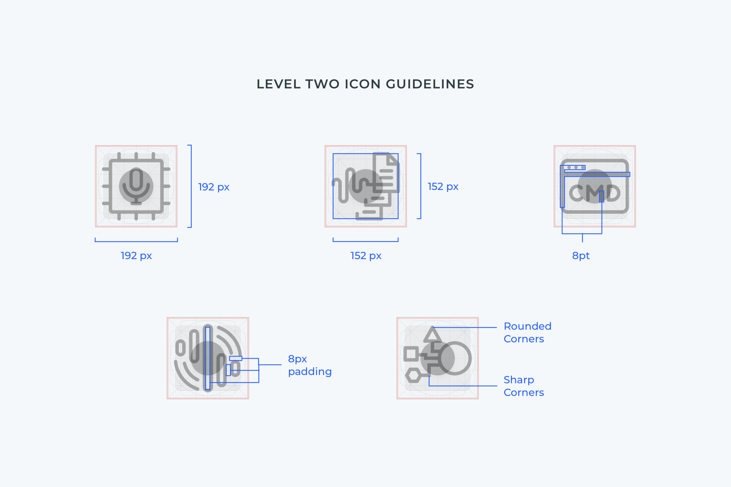
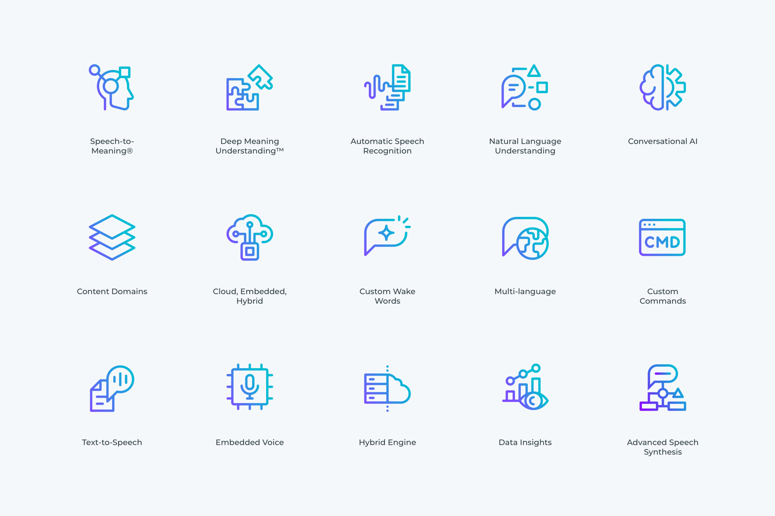
When we thought through the iconography for the brand, we needed something a style that would work as a small and large sized visual. Thus we created the Level One and Level Two icon system. Level One icons are used in larger spaced areas. These are more detailed elements, veering towards an illustrated look. Level Two icons are a simpler, outlined version of the larger Level Ones. These smaller elements are used mainly in web layouts, presentation decks and social postings. For consistent creation, both are developed on a grid system with rulesets.


Site Architecture [Desktop View]
Product Pages
Site Architecture [Desktop View]
Solutions Pages
Design System
Principles, color, grid, iconography, illustration, typography, logos, downloads.
[Desktop View]
Video Example
Credits:
Client: SoundHound AI
Brand: Houndify
Executive Marketing Team: Mike Zagorsek, Thrupthi Reddy, Bryan Lee
Creative Director: Bryan Lee
Senior Visual Designers: Bryan Lee, Beau Parent, Tamar Ben-Baruch
Copywriters: Mike Zagorsek, Thrupthi Reddy, Karen Scates
Development Team: Adam Jenkins, Ryan Rouleau, Nikki Sharifli
Project Manager: Maria Poley


